Opinions Please!
First, several have left comments with questions. Your comments come to my e-mail, as well as being posted in the comments section here. I love receiving comments but some of you have your settings so that all I see is "no reply" or "anonymous" when I try to reply. When you ask questions and your settings are set to where I can't hit "reply" and send you an e-mail, then I have to go back into the comments section, find your questions and post the answers here. So, if you want an answer to any of your questions, you need to change your settings so that I can hit "reply" to your e-mails and it will work.
Second, I did a podcast with Catherine at QOV and it is now posted. For those of you who read what I write, you can now hear what I say! Not like there's anything really earth shaking but I talk about . . quilting! :) You can get there by going to QOV Foundation and clicking on "podcasts". The audio is kinda bad in the beginning, gets better towards the middle and then gets bad again towards the end.
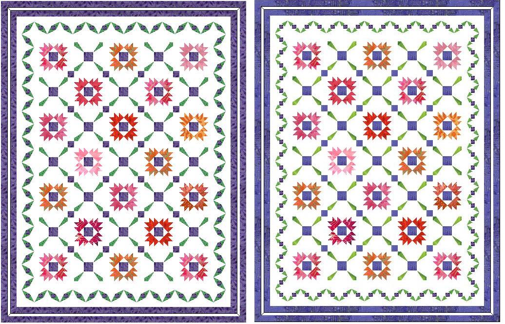
OK . . here's where I need your opinions. On the quilt I am working on, the border is from Quilters Cache and I don't want to run into any copyright problems so I decided I should change it. I don't feel comfortable if I ever decide to enter this quilt in a show having used her pattern, even though I wasn't going to piece my border like she has hers . . it's still her design. Here are two options that I came up with. Don't forget you can click on the picture and make it bigger. Here's what I would like for you to tell me.
(1) You like the one on the left best.
(2) You like the one on the right best.
(3) Neither of these are as good as the one from Quilters Cache.
Don't worry about hurting my feelings. I'm loving this quilt and I want it to be right and, if I didn't want to know what you really think, I wouldn't ask. If the majority thinks neither border does the quilt justice, I'll just keep playing til I get it right. And, if you don't want to post your opinion publicly, you can e-mail it to me: Laquidara@gmail.com
And, don't worry about my green and purple blending. It kinda looks like it does in these pictures but the green is so bright! I don't think there's a color on earth with which it will blend. I would probably not have chosen this green at the quilt shop but it was in my stash and it's going to get used! :)
 Thanks!
Judy
Thanks!
Judy
posted by Judy L. at
6/25/2006 10:08:00 AM
![]()


30 Comments:
Of the two borders, I prefer the one on the left much more... Have you tried recreating the the sashing pattern around the outside as a straight border? Don't know how that'd look, but it comes to mind... Good luck finding "the one"
By quiltpixie, at 6/25/2006 11:05:00 AM
Hi Judy!! Both appeal equally to me, but I did notice this, the one on the right made my eyes focus on the center blocks and sashing. The one on my left, My eyes first went to the border. I think you have a decision to make :-)
By Anonymous, at 6/25/2006 11:33:00 AM
Judy,
I think that the one on the left is "chunkier" and frames better. I like both of them though. I also think that the one on the left pays tribute to the blocks in the center more.
They look beautiful.
By DarleneN, at 6/25/2006 11:39:00 AM
I like the border on the left better, because I think it's in better proportion to the blocks. The one on the right has pieces that are smaller and "fussier looking" than the pieces in the blocks. I think the one on the left looks fine.
By Patti, at 6/25/2006 12:34:00 PM
Yep, I'm a leftie, too. I think it frames the quilt better. But you can basically ignore this because I have absolutely no eye for design! LOL
They're both beauties, Judy, whichever you decide!
By Vicky, at 6/25/2006 12:52:00 PM
This comment has been removed by a blog administrator.
By Ramona-quilter, at 6/25/2006 02:54:00 PM
Let me see if I can tell left from my right this time. What I meant to say is....
right. Those green pieces in the border look like arrowheads to me and I have never seen a border treatment like it. If the QCache pattern is the one below the 2 contenders, well, it just lacks your normal pizazz. I can't wait to see what you choose.
By Ramona-quilter, at 6/25/2006 02:57:00 PM
I really like the one on the right!
By Silverthimble, at 6/25/2006 03:01:00 PM
I like the light and lacey feel of the one on the right, I think it emphasizes the points on the stars. But I don't think that you can go wrong with eithr choice. (now check my blog and give me some advice on which fabrics to choose! Your advice is worth more than mine - LOL)
By Gail, at 6/25/2006 03:59:00 PM
Hi Judy
I like the right one because it doesn't call attention away from the stars. The onw on the left looks like eyes.
By quiltcontemplation blogspot, at 6/25/2006 04:36:00 PM
Personally I like them both! Tough decision you have! :-)
By Darlene, at 6/25/2006 04:59:00 PM
I like the one from Quilter's Cache. I'd ask Marsha and see what she thinks.
Hugs,
Melinda
By Unknown, at 6/25/2006 05:39:00 PM
I agree with Melinda...I like the larger scale of the Quilters Cache border better. Wonderful quilt, no matter how your frame it!
By Unknown, at 6/25/2006 05:56:00 PM
My first thought was that I liked the quilter's cache one best but after looking at all three for a bit I think I really like the one on the left the best. It frames your center best without overpowering it.
By Nancy, at 6/25/2006 06:09:00 PM
I like the right!
Carolyn
By Carolyn, at 6/25/2006 06:30:00 PM
My vote goes to the right.
By dot, at 6/25/2006 06:34:00 PM
Judy,
I am posting this without reading ANY comments...I don't like either. At first I thougth I liked the right one but it was too "light/thin". Then I thought the left one was good, but I think it's too "heavy/thick". I think I like the Quilter's Cache one better so far.
Hugs
Laurie
By Laurie, at 6/25/2006 06:52:00 PM
The QC's or the left. I like the ribbon look.
But of the two in this posting, I like the left.
The right one doesn't look proportional.
By Leah Spencer, at 6/25/2006 06:59:00 PM
the right for me---for what my opinion would be worth. You can see the square of purple so much better and it seems to accentuate the points more clearly.
By Linda C, at 6/25/2006 07:36:00 PM
At first I liked the one on the right, but after studying them for a while, I think I like the one on the left better. The quilt is so beautiful - and both your border designs are spectacular. Good luck deciding.
By Bonnie, at 6/25/2006 08:19:00 PM
I like the one on the left best. It just appeals to me more.
By Patty, at 6/25/2006 08:22:00 PM
Judy! I just listened to the Podcast! Fabulous interview!
And I realized, I miss your accent!! LOL!!
((HUGS))
By Vicky, at 6/25/2006 08:48:00 PM
Definately the one on the right for me, the left one looks clunky, the right one just blends beautifully!
By Anonymous, at 6/26/2006 04:26:00 AM
I like the one from Quilter's Cache best - sorry! But of yours I definitely prefer the one on the left.
By Kate, at 6/26/2006 05:27:00 AM
I prefer the one on the right - it mimics the sashing blocks and ties the quilt - the other borders don't look like they "fit" the quilt and were put on as an afterthought.
By Kim West, at 6/26/2006 07:00:00 AM
Hey Judy!! I think you should make all 3 of them, they are all gorgeous!! You have inspired me!!
By bmorerealtor, at 6/26/2006 07:12:00 AM
It doesn't really matter which one I like - but I will say that in the smaller version of the picture, they both look sort of the same. I don't know how small the pieces are going to be, but will either of them look radically different from the other in the real size? Now, with that said, I prefer the QC version because it lets your blocks shine - and I've seen the QC version in lots of different places, not copyrighted by any once source - could it be an open source pattern from the past?
By Quiltgranny, at 6/26/2006 09:19:00 AM
I like Marcia's border better for the quilt. Also, wanted to say "Congratulations" on the upcoming book and your podcast debute.
By Anonymous, at 6/26/2006 11:00:00 AM
A bit late... but number 1 for me the the quilter's cache border (scale), number 2 would be the one on the right (opposite reason for the first - go figure!)- all would be fine...
By The Calico Cat, at 6/26/2006 11:37:00 AM
I like the left one. It seems proportionate and it anchors well.
By Anonymous, at 6/28/2006 04:06:00 PM
Post a Comment
<< Home