Black/White Dots Anyone?
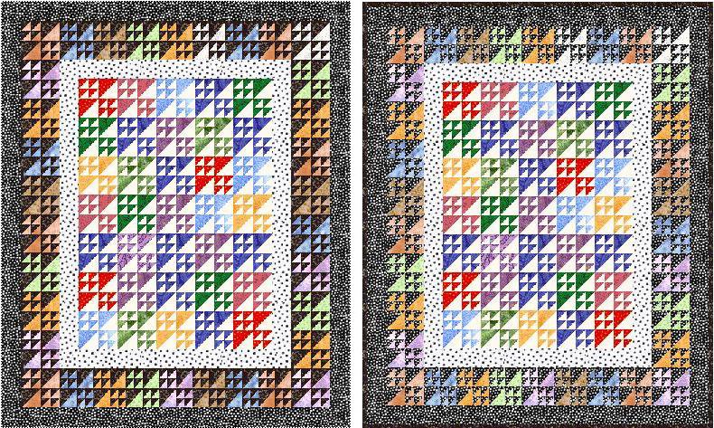
I've been thinking about this Birds in the Air quilt but it's going to be probably a week before I can work on it. Several suggested black or dark around some outer rows. I love black/white dots so here are a couple of EQ drawings I've come up with. Any thoughts on which one you like better? You can click on the picture to get a bigger image.
 Judy
Judy
posted by Judy L. at
11/26/2005 09:30:00 AM
![]()


16 Comments:
Judy,
I like the one on the left better. I think the darker black helps add dimension to the quilt...makes that border POP more! You always amaze me! Keep up the great work!
By Laurie, at 11/26/2005 10:06:00 AM
Definitely the left-hand one. I think using the same fabric for background (last row of blocks) and border makes for a slightly more washed out look. I had to enlarge the picture to see why, though. But definitely the left one.
By Caroline, at 11/26/2005 10:39:00 AM
I vote for the one on the left too!
By Carolyn, at 11/26/2005 12:53:00 PM
left from me too....
By quiltpixie, at 11/26/2005 02:33:00 PM
OK, I'll just be diffucult! I like the right one. Having the polka dot fabric in the blocks makes it look like they are floating.
Both ways look good though!
Sarah
By Sarah, at 11/27/2005 05:36:00 AM
Definately the one on the left. The other one looks kinda "blurry' to me.
By Nancy, at 11/27/2005 07:09:00 AM
I also agree that the left one gives more pop to your hard earned birds in the air. What if you made a smaller white/black polka dot strip along with a black polka dot strip in the middle? That way it would pul in the outer border?
By Quiltgranny, at 11/27/2005 07:13:00 AM
At first glance, I liked the one on the left better, but the one on the right kinda grows on ya -- more of a Maverick type quilt!
By Joanne, at 11/27/2005 07:48:00 AM
I also like the one on the left- the right hand one seems a bit weak.
By Anonymous, at 11/27/2005 09:40:00 AM
I like the one on the left better too! It makes the colors more intense in the center of the quilt for me...and I'm one who thinks the more fabrics the merrier! *LOL*
Great quilt! I made My son's graduation quilt from the same block, and it was all black/white/grey. Very graphic, and the perfect block for it!
Bonnie
By Bonnie K. Hunter, at 11/27/2005 02:46:00 PM
I'm going to suggest the one on the right because I think the faded, floating border idea gives the center more importance. Also, the first one is very predictable & not very "Maverick" as Joanne mentioned.
Ultimately, you have to decide what works for your tastes. Both are definitely acceptable ideas!
By Debra Dixon, at 11/27/2005 04:10:00 PM
How about if I like them both..? Each for a different reason, that really helps, doesn't it??? *VBG*
Great job of choosing a fabric tho!!
By Finn, at 11/28/2005 08:53:00 AM
left.... (I agree about the blurry comment)
Amy - not on her PC - so anonymous will have to do....
By Anonymous, at 11/28/2005 10:47:00 AM
Oh I love these blocks and have always wanted to make a quilt with them. I love these! I like them both!
By Quilts And Pieces, at 11/28/2005 12:58:00 PM
so, lots of ideas Judy, what ever shall you do????
By quiltpixie, at 11/28/2005 02:23:00 PM
Okay, I am trying not to read the other comments so I won't be persuaded by someone elses arguement. I like the one on the left...the darker color really makes the blocks/color pop. Too many dots on the right tend to blend it too much.
By Catherine, at 11/29/2005 08:15:00 PM
Post a Comment
<< Home